
Using white ink is a great way to make colours really pop when printing to substrates that aren’t already white. It is also useful when printing to a transparent material such as acrylic or window film and we’ve created stunning results printing directly to black surfaces. Following requests for guidance on how to set up a white spot colour, we have created a set of simple instructions to help you.
The process is slightly different for vector graphics (e.g. Indesign and Illustrator) and bitmap graphics (e.g. Photoshop). But the principles are the same by creating a fifth colour addition to the standard CMYK and then analysing the separations in Adobe Acrobat to check the overprint.
This is applicable for both Adobe Illustrator and Indesign.

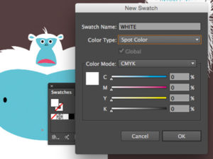
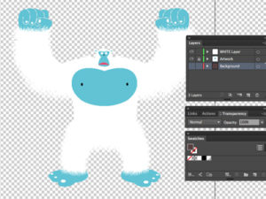
Add a new SPOT colour to your swatch palette. Call it WHITE. It doesn’t have to look white, it can even be pink so you can see it more easily.
Choose the areas you want to be WHITE and consider if you want to print white behind the other colours. Create a layer with WHITE areas.
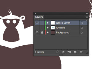
Knockout areas that you don’t want to be printed white. In this example we have chosen to only print the hair, nails and eyeballs in WHITE.
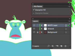
Select the WHITE areas. Using your ‘Attributes’ panel select ‘Overprint Fill’. This will make sure the WHITE spot colour doesn’t knock-out your artwork.
Now you can export the file as a PDF. Hide any background layer that helped you to see the WHITE. If you are printing WHITE behind all your artwork, you might not be able to see the artwork at this point, but the overprint setting means that the colours behind will sit on top of the white layer when printed.
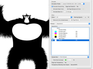
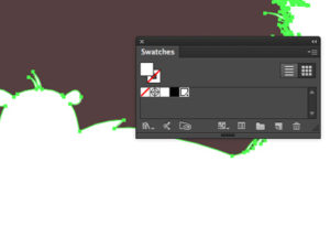
Check your separations in Acrobat to ensure the spot WHITE is listed and is in the correct areas.
By default, the WHITE layer is always printed first with the colours on top, but we can specify WHITE to print on the top or even sandwiched between two colour strikes if your design requires it.

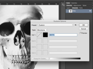
This photograph of a skull is a greyscale image. Change the colour mode from greyscale to a Monotone using the ‘Duotone Mode’ option. Call the ink WHITE. Again, this can actually be any colour. If it’s called WHITE it will print white.
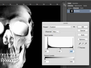
Once in the ‘Monotone’ mode, wherever the image appears black, it will print as white, which means that the image needs to be ‘inverted’ as shown above. You may need to adjust the levels to really bring out the black which will print as white.
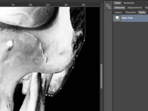
The black background will also print white, so to avoid this, make the background appear white or float the skull on a transparent layer.
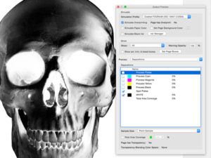
Save the file as a PDF and the separations can be checked to ensure there is a WHITE layer and it appears in the right areas. White can also be achieved in CMYK mode by adding an additional ‘Channel’ called WHITE. Any imagery the appears in WHITE channel with print white.