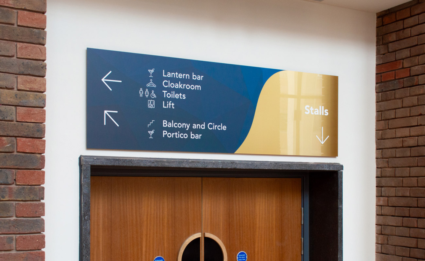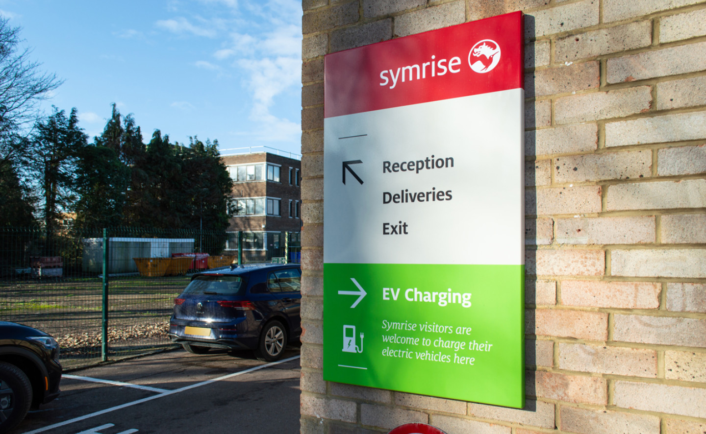

We have a range of Signage Products designed for all types of projects to will fill you with inspiration.
The importance of fonts and spacing. The font or typeface you choose for your signage says a lot about your business. Scripty, thin, or extended letter styles are more difficult to read unless they form a well advertised brand name or logo such as CocaCola. The size of the letters and the spacing between them has to be considered to make it as legible as possible and avoid confusion.
Bigger isn’t always better. Consider the viewing distance and the types of potential customers you are appealing to. Passing vehicle traffic will need a larger sign with larger text and less content, so anything over ten words will be left unread or may put them off even attempting to read it as they drive past. Pedestrian areas won’t need such a large sign, but there is opportunity here to use textures and different materials to really promote what your business is about.
It’s widely known that the best contrasting colour combination for legibility is black and yellow, but unless you’re selling diggers or insect repellant, it’s not the most appealing of palettes for many businesses. Consider using your logo colours for brand consistency, (referencing the Pantone or RAL number) and ensure there is enough contrast to read the message. It’s a good idea to get a sample of the colour you have chosen because the colour you see on your screen is not always what will be printed.
Trying to squeeze too much information onto a sign only makes it more difficult to read. Now is the time to consider your ‘critical information. Do you really need to display your fax number? Consider your audience and if they need a telephone number or just a web address where they can find all the information they need. An experienced designer can help you communicate the core message and advise what information should be included and promoted.
Signs will be more legible if they are placed in a position without competing or confusing backgrounds. Consider the style of the area and surrounding business signage to make the most of the space. You can still achieve impact without there being a flashing neon sign in every window. It’s important to note at this point, that some signs may need planning permission depending on what you want to achieve, so ask a signage professional for advice.
A designer with production knowledge is your key to delivering a successful sign that will last for years to come. They can create workable concepts that meet both aesthetic and budgetary requirements because they will design with the materials and build-ability in mind. Polished or brushed metal, dibond, aluminium, steel or zintec, a range of laminates and finishes, wood effect powder-coating, solid wood, glass etching, cut vinyl or acrylic. The possibilities are endless.
If you’d like some help with your Signage and Wayfinding project, our friendly team would love to hear from you. Call 01332 613000 or fill in the form below!

