
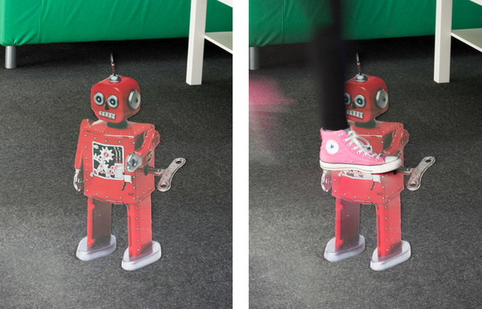
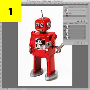
Anamorphic art is the name given to the fantastic 3D illusions that can be seen chalked to the paving stones in town centres, or sprayed onto football pitches for televised games. And they can look incredibly impressive. We have seen an increased demand for anamorphic floor graphics and to help you understand what makes a successful design we’ve listed some top tips to consider.
1. CHOOSE THE VIEW POINT
Effective anamorphic design depends entirely on where you are stood to view it. Stand in the wrong position and the graphic will just appear warped and stretched. As a viewer, the fun can sometimes be finding the optimum viewing position, but if you need your graphic to have instant impact, choose a location and a view position that most people will use. This could be an entrance, an exit, a thoroughfare, a waiting position or dwell area. Then you can use this position as your ‘optimum view-point’.
2. BIGGER THE BETTER
Anamorphic design will appear warped from the wrong view-point, so to minimise this, go big. A large design will increase the distance you can travel from the ‘optimum view-point’ before the image will appear warped. For example, a small design will begin to warp with a positional-shift of only a few inches (and this warping also includes the viewer being a different height). Large format designs that measure several metres will have a greater tolerance before you will see any warping in the graphic. If your design will be viewed from a long distance away, this will also increase the tolerance before it becomes warped.
3. THE ANGLE OF THE SUBJECT MATTER
Consider the effect you are trying to create and find imagery that reflects this, and at the right angle. This can be easier said that done, because photographs of ‘open mine-shafts’, ‘sharks leaping out of the water’ and other popular illusions can be limited. If you want the floor to open up to reveal sewer pipes beneath, then you’ll need an image of the sewer pipes from this angle. It is at this point that you may want to consider an illustrator or artist to draw exactly what you want. If the design is a logo or an existing graphic, such as the style used on football pitches, then this issue doesn’t apply.
4. CONSIDER THE SURFACE
A lot of anamorphic street art is chalked directly onto the paving slabs or pre-drawn on to canvas. This is effective because it absorbs light rather than reflects it. Consider the surface that your graphic will appear on and choose a matte substrate. Any shine or light reflection will work against your 3D illusion and ruin the effect. For example, there is a great malleable product called Alumigraphics that can bend over brickwork, concrete and paving slabs, G-Floor can offer a more long-term solution, or there is a range of matte carpet vinyls for indoor requirements.
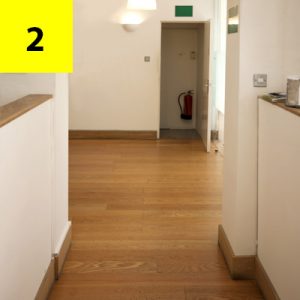
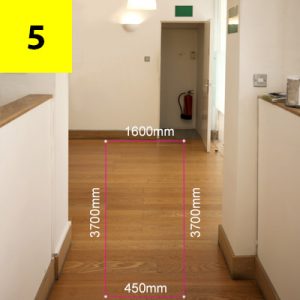
5. SURVEY THE AREA
The key to preparing your anamorphic design accurately is a good site-survey. Measurements are of paramount importance and this begins at your ‘optimum view-point’ with an idea of your final artwork in mind. Here is an example of how it works…


Related Project
CHARNWOOD CAMPUS
Charwood Campus
Charnwood Campus approached us to design, produce and install a full suite of outdoor wayfinding and decorative graphics. Charnwood Campus…
view project